Always in motley—always—looking to make a living, I agree to work for the marketing department of a regional theatre troupe. What could go wrong? Any graphic design job boils down to how well you stand on your head for your next meal, right? I'm fairly adept with graphic design and working for in-house marketing departments. And I'm
I inherit show art long developed for the season, already in progress. While I'll be tasked with creating show art for upcoming seasons, for now, I can ease into the new job working with some fun, well-photographed work designed by my predecessor.
 |
| Exhibit A |
Exhibit A: Orange, black and white motley on the characterization of Truffaldino, the star character in Carlo Goldoni's The Servant of Two Masters. The photograph is hand-standing over a platter of food, along with a logotype as a playful arrangement of the the title.
Moving forward
I discover soon enough the routine change-over from show art to quotes art, where well-worded, sometimes cherry-picked quotations are culled from critics' reviews in the local press. The goal is to drive ticket sales based on the love the critics have for the show. Because you know, you always take a reviewer's words to heart when deciding your next evening's entertainment. |
| Exhibit B |
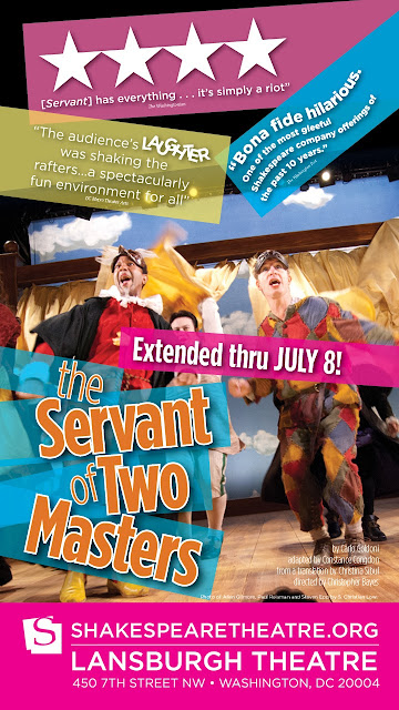
Exhibit B: Production photo overlaid with quotes and title.
The new artwork demonstrates my desire to remain true to the current branding. I tighten up the billing and logotype for the show. I continue the same font and main orange color. And I push the topsy turvy design from the logotype to a new conclusion.
I take the multicolor motley from Truffaldino's costume and lay in color bars behind each of the necessary text elements, giving them a bit of transparency to provide for more visual depth and interest.
Taking advantage of the strong, random diagonals of the title, I continue those diagonals throughout the composition. This allows me to lay in bright white text over the photograph with a coherent design scheme, while punching up the fun factor. Initially, I use the colors from the costume: red, rust yellow, green and blue. Knowing this artwork will be printed on newsprint, I opt for a trick to pop the colors even more, translating the red, rust yellow and blue to pure magenta, yellow and cyan, respectively. (My painting professors roll their eyes—no sophisticated palette here.)
 |
| Half-page ad for MetroWeekly |
The result is playful and readable. By pushing the design cues from the previous art and the production photo from the show, I provide a suitable, familiar—yet new solution in a new voice: mine.
No comments:
Post a Comment